When you visit a website, you probably don’t put too much effort into thinking about how much time you spent browsing, what you enjoyed looking at, or what made you click away to something else. The psychology of web design plays a huge role in the creation of a good website. This goes deeper than picking nice colors and flashy imagery. A great designer will consider how to build a beautiful looking website that draws you in, guides you to the appropriate content, and keeps you clicking for more. Let’s dive in!

Let Content Shine
It’s easy to “over-design” a page to make it stand out. This could involve a really elaborate logo, detailed imagery around content, and bold, vibrant colors. If you are not careful, it is easy to create a messy website. Truthfully, it may not even be obvious that your website could have poor design until changes are made to improve flow and readability.
Ideally, your background details should trend on the muted side, so that the featured image and text for the focal point of your website can “pop” and draw the reader’s attention to what matters.
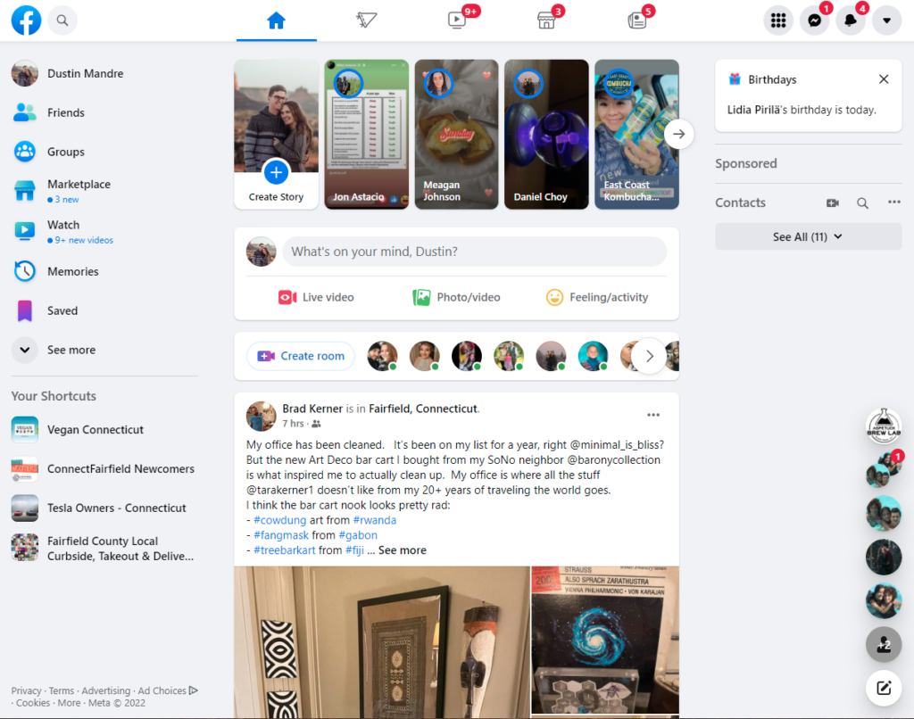
Facebook is one great example of muting the many options, settings, and features and enhancing the content it wants you to see by using imagery to draw your attention.
It can be tempting to try to reduce the amount of scrolling on a page by cramming as much content into every nook and cranny on a page. Unfortunately, it does not inspire readers to actually read all that is displayed. It has the adverse effect. Psychologically, readers will be deterred from reading if there is too much to look at.
Less is More
By incorporating negative space, changing background colors or text styles to separate thoughts, it gives the reader an indicator of when to “take a breath” between thoughts. This helps them digest what they are reading in a more manageable way. I like to compare it to eating popcorn. Small bite-sized pieces are really easy to consume, and it tastes good, so you keep eating. Before you know it, you finished the whole bag.
This also applies to font size, not just the amount of text on a page. While smaller fonts make it easier to fit more text in a given space, remember who your reader is, and not everyone enjoys squinting. Size your text appropriately and don’t be afraid to make your page elements larger than life!
This concept also calls back to letting content shine. If there is too much content, none of it truly shines.
World of Color
Have you ever wondered why so many brands use the color blue in their logo and general color schemes? It’s definitely not an accident. Blue evokes emotion, and generally is accepted as trusted and professional. All colors evoke an emotional response, whether you consciously acknowledge it or not.
A page with deep red tones and a dark background might feel a bit zany and emotive. Whereas a website with light lavender tones creates a sense of calm. Have you ever wondered why most websites have a white background with black or dark grey text? It’s easier on the eyes than a black background with white text. Don’t believe me? Try reading a webpage that has a dark background, and you might find yourself clicking away sooner than a page with a white background. It’s subliminal, but important for web designers to acknowledge in order to get readers to stay on a page for as long as possible.
Choosing the right color for your website and branding is essential to telling the story of your brand or persona. Color can also help content shine. As mentioned in the first section, the most vibrant parts of your website should be the content you want viewers to see first or the content that is of the highest importance.
Psychology of Web Design
The 3 ideas mentioned above only scratch the surface of the study in the psychology of web design, but I hope it’s enough to think differently when you visit your favorite websites in the future.

